Style Guide Design Packages
The table below gives an overview of my Style Guide Design Packages…
Every business is different and therefore has its own unique needs, most of which will have been addressed during the Branding Design process. However, when it comes to the actual content, one Style Guide will be more or less the same as the next for the majority of businesses. The main differences will be in the rules themselves and, of course, the presentation of the information it contains.
The following packages differ primarily in their extent – that is, how many pages they contain – which will mainly depend on the complexity of the client’s branding, which is, itself, dependent upon the kind of assets produced during the Branding Design process… ie. the more complex the assets, the more guidelines required to describe them.
The best way to decide which package to choose – or whether you should build a bespoke package to suit your specific needs – is to arrange a free consultation with me in order to discuss your project in full. I will then be able to give you some informed advice on the most effective approach to take.
Bronze£700 |
Silver£1050 |
Gold£1870 |
||
|---|---|---|---|---|
Style Guide Document (PDF) |
( i ) Style Guide Document – The main part of your Style Guide is, of course, the document itself, provided as a multi-page PDF, which can be shared with 3rd-party designers and artworkers, in order for them to produce whatever assets you may need. |
UP TO 8 PAGES |
UP TO 12 PAGES |
UP TO 16 PAGES |
Document Structure: |
||||
Front Cover |
YES |
YES |
YES |
|
Contents Page |
YES |
YES |
YES |
|
Foreground Images |
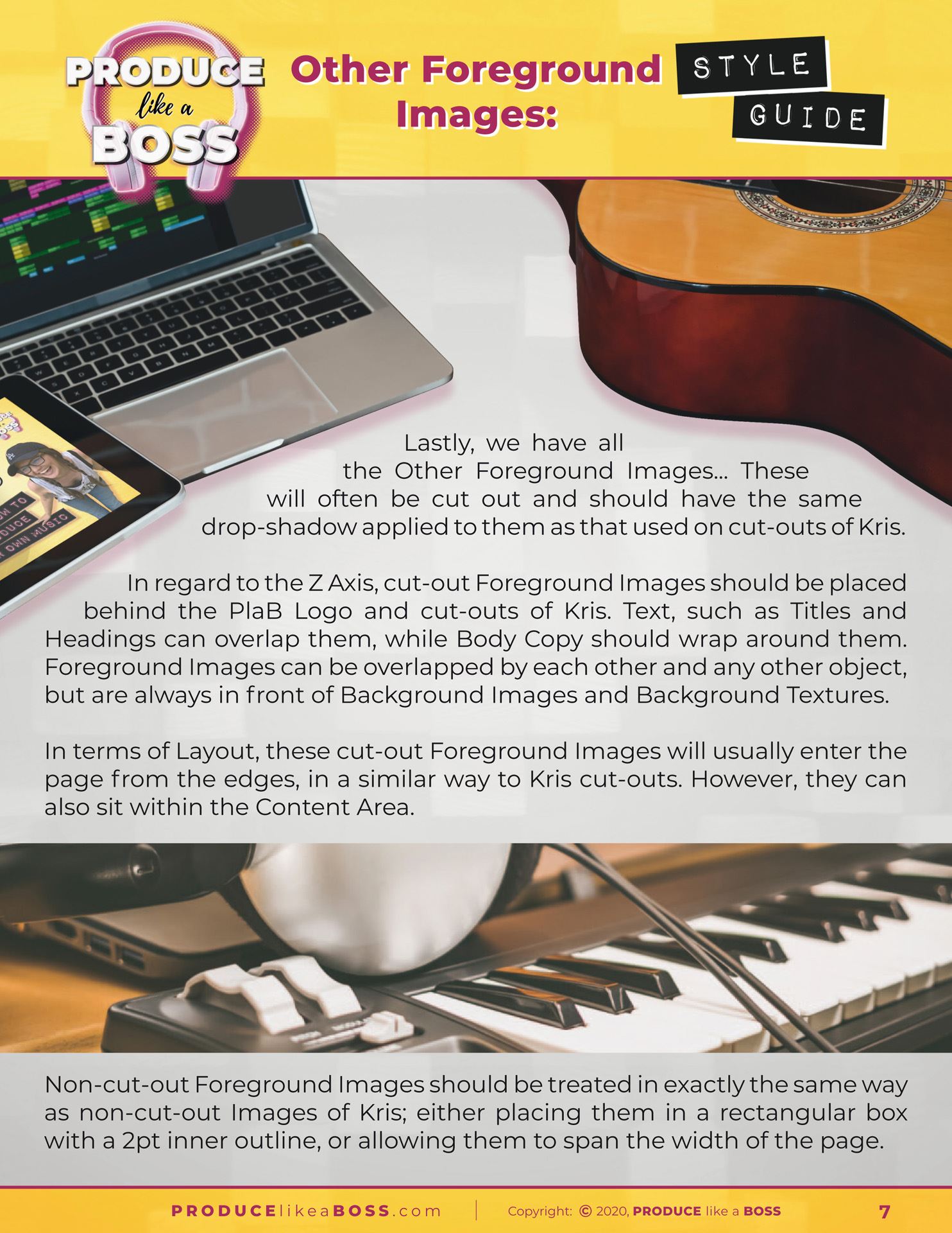
( i ) Foreground Images – These pages will show how images are to be arranged within the body of your content, taking into account various usage cases. |
YES |
YES |
YES |
Background Images/Textures |
( i ) Background Images/Textures – There are a number of options for the arrangement of background images and textures. Those specific to your branding will be outlined here. |
– |
YES |
YES |
Colour Chart/References |
( i ) Colour Chart/References – Every brand will have a selection of colours, all of which will need to be specified numerically, usually as RGB, CMYK, HEX and Pantone references. |
YES |
YES |
YES |
Text Formatting Specifications |
( i ) Text Formatting Specifications – The rules which define how text is used in your branding are essential, so these pages will outline everything from headings and sub-headings to body copy and block quotes… and everything inbetween, including fonts, sizes in pt and px, weights, colours, styles and more. |
YES |
YES |
YES |
Content Objects |
( i ) Content Objects – There are numerous kinds of content objects that may be included in any given asset design, such as tables, splashes, dividers, icons, sidebars, headers, footers and beyond, all of which will be specified within these pages. |
YES |
YES |
YES |
Supporting Materials: |
( i ) Supporting Materials – Accompanying the Style Guide Document itself, will be a number of additional files, which can be shared with 3rd-party designers and artworkers, so that they can be used to create new assets. All of these will be supplied with your completed Style Guide. |
|||
Logos: |
( i ) Logos – All your logos will be included in a range of sizes and styles, according to what you have had produced, such as different arrangements, monochrome versions, etc., and supplied in a range of file formats. |
|||
|
Main Logos (JPG/PNG) |
YES |
YES |
YES |
|
|
Condensed Logos (JPG/PNG) |
– |
YES |
YES |
|
|
Social Media Avatar (JPG/PNG) |
– |
YES |
YES |
|
|
Favicon (JPG/PNG/ICO) |
YES |
YES |
YES |
|
Foreground Images (JPG) |
( i ) Foreground Images – All foreground images used in the creation of your 5 assets will be provided at their maximum size, so that they can be employed, if needed, when creating new assets. |
YES |
YES |
YES |
Background Images/Textures (JPG) |
( i ) Background Images/Textures – Any background images and/or textures created during the Branding Design process will be supplied at full resolution, so they can be applied to future assets. |
– |
X 1 |
X 2 |
Colour Chart(s) (JPG) |
( i ) Colour Chart(s) – A separate JPG of your pallete(s) will be included with your Style Guide, to make it easier for 3rd-party designers and artworkers to select the desired colour as they work. |
X 1 |
X 1 |
X 2 |
Colour Reference Sheet (TXT) |
( i ) Colour Reference Sheet – In certain situations, it’s easier for 3rd-party designers and artworkers to copy and paste plain text HEX and other colour references into the assets they are working on. |
YES |
YES |
YES |
Fonts (TTF/OTF) |
( i ) Fonts – All fonts and font families relating to your branding will be provided in the appropriate file formats for quick and easy installation and use. |
X 1 |
X 2 |
X 3 |
Assets (JPG/PDF) |
( i ) Assets – Each of the 5 assets created during your Branding Design will be provided in the appropriate file format(s), so that these can be referenced during the creation of new assets. |
X 5 |
X 5 |
X 5 |
Asset Templates (InDesign/PSD/PDF) |
( i ) Asset Templates – Depending on whcih package you choose (or if you opt to include these templates in a bespoke package), you may receive the actual design file used to create each of your assets. These multi-layered documents can then be used as templates for the creation of new assets based on their design, or for quick extraction of certain elements for use in new designs, allowing for an efficient design process. |
– |
– |
X 5 |
Please feel free to drop me a line and I’ll be happy to arrange a free consultation…
We’ll discuss your needs in depth, so that I can form an accurate idea of what you’re looking for and the best way to approach the design of your Style Guide and anything else you may require. I’ll follow up our chat with an itemised no-obligation quote that is tailored to you and your business.
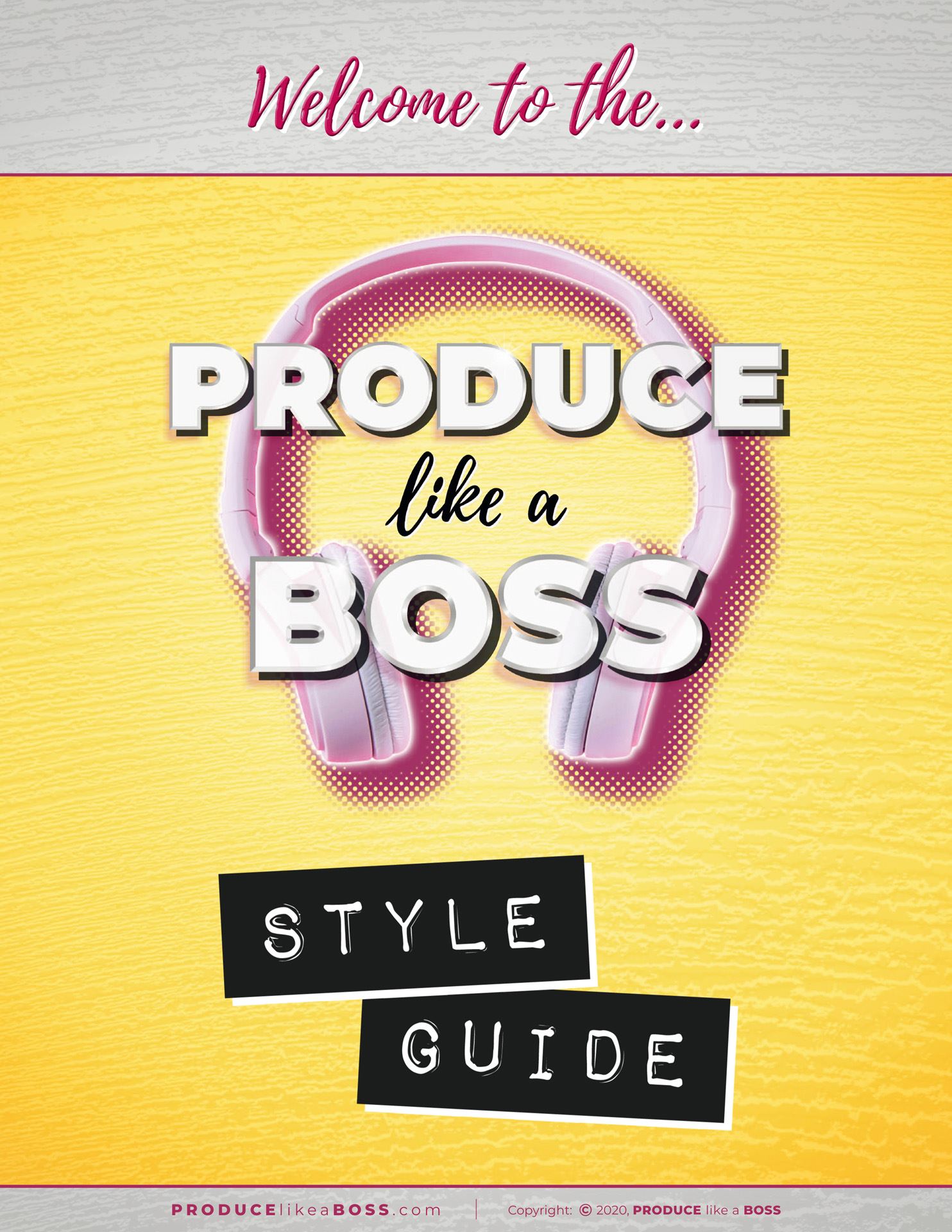
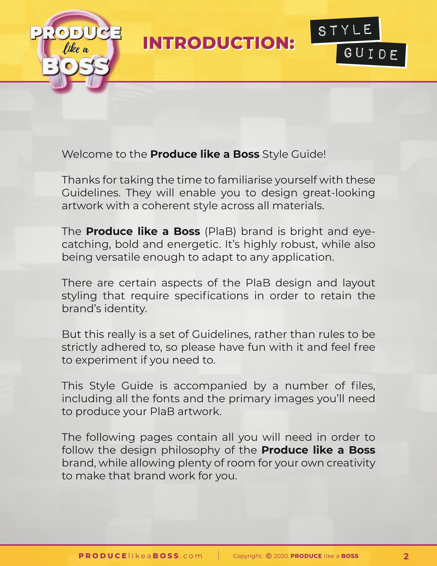
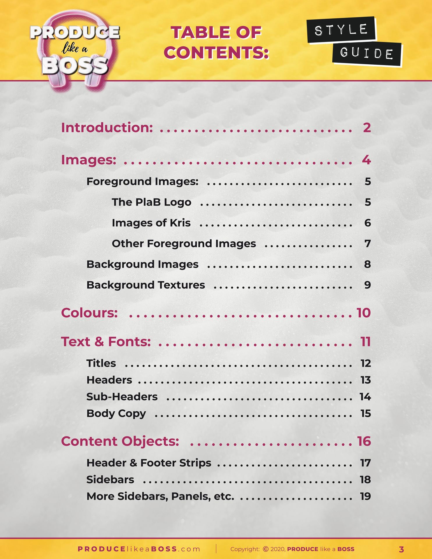
Example Style Guide
Below are the pages of a typical Style Guide, describing the various aspects of the client’s Branding and the rules – or guidelines – associated with it.
The Style Guide, itself, adheres to all these rules and displays a visual representation of text and images, as well as detailed descriptions of how each of the various elements can be laid out and combined in order to produce an unlimited assortment of marketing assets.
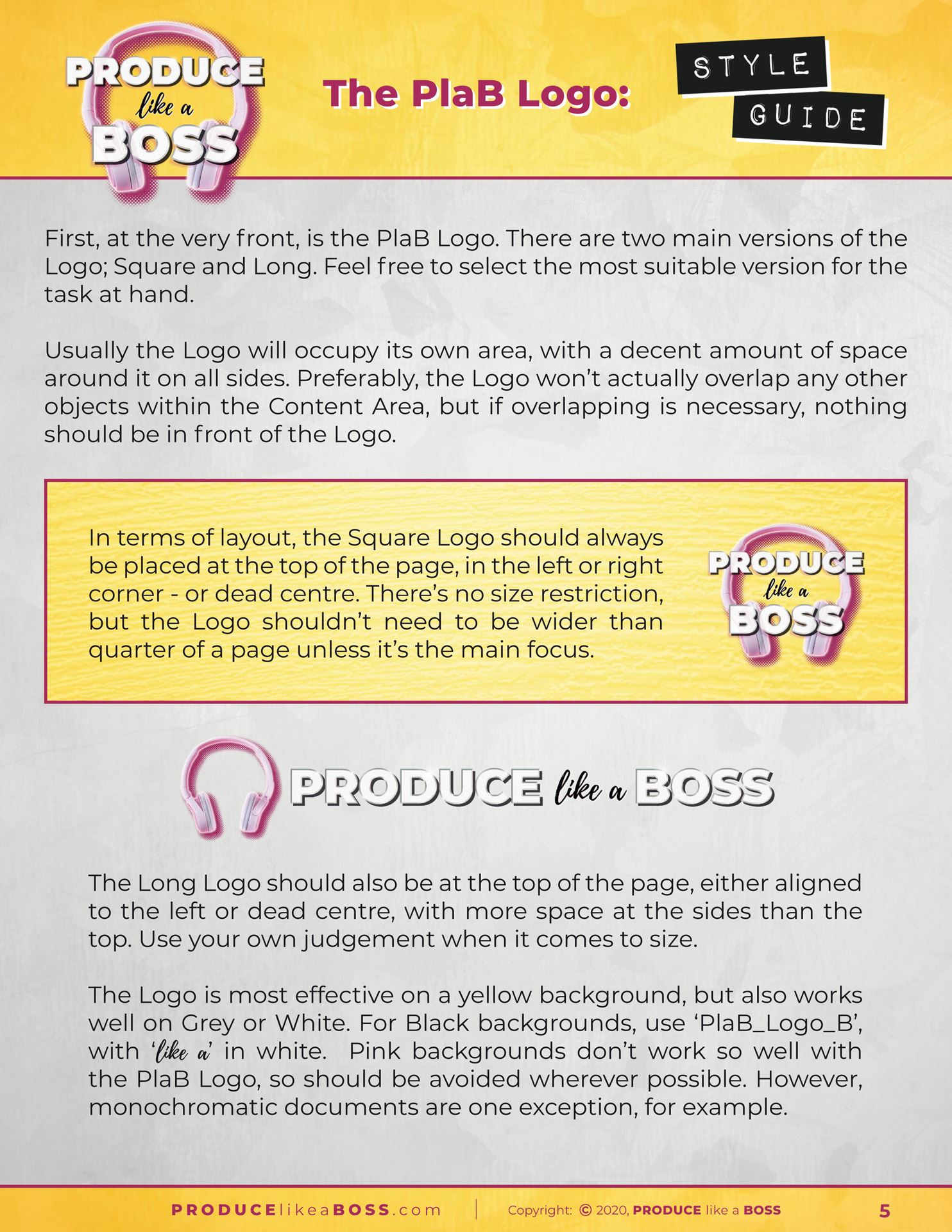
Logo Page
The most prominent image in most asset designs is the brand’s logo, so the first images page is given over to this, describing positioning, size relationships and everything else to do with how the logo should be placed within any given asset’s design and layout, noting the differences between the various logo types and compositions.
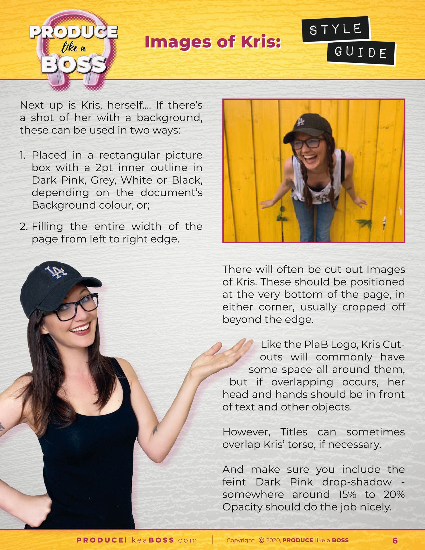
Primary Foreground Images Page
Some foreground – or content – images have a greater importance than others. In this case, images of Kris have specific guidelines as to how they should be featured within a document’s layout. If you have certain images that play a key role in your branding, these will similarly receive a special mention.
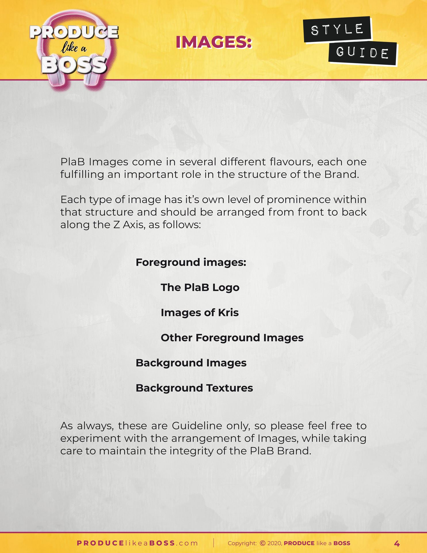
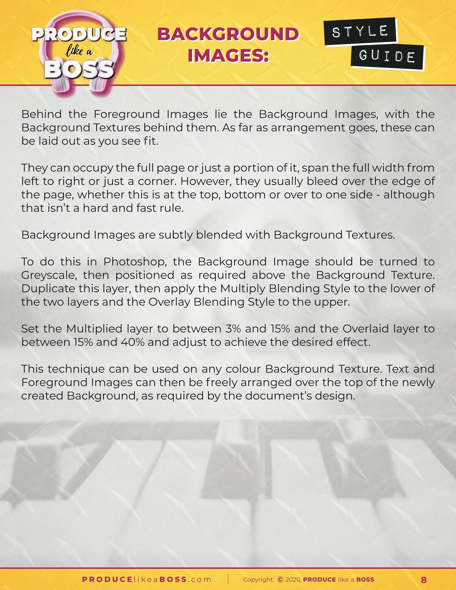
Background Images Page
The styling of background images is usually relatively subtle, as they are to be used behind the main content, as a textural backdrop, so as not to interfere with the legibility of text or the flow of images and other content objects.
You may choose to have background images as part of your branding solution, or you may prefer not to include them. The decision is yours, of course, which will have been made during the Branding Design process, but if you do want to have them play a part in your styling, they will be featured here.
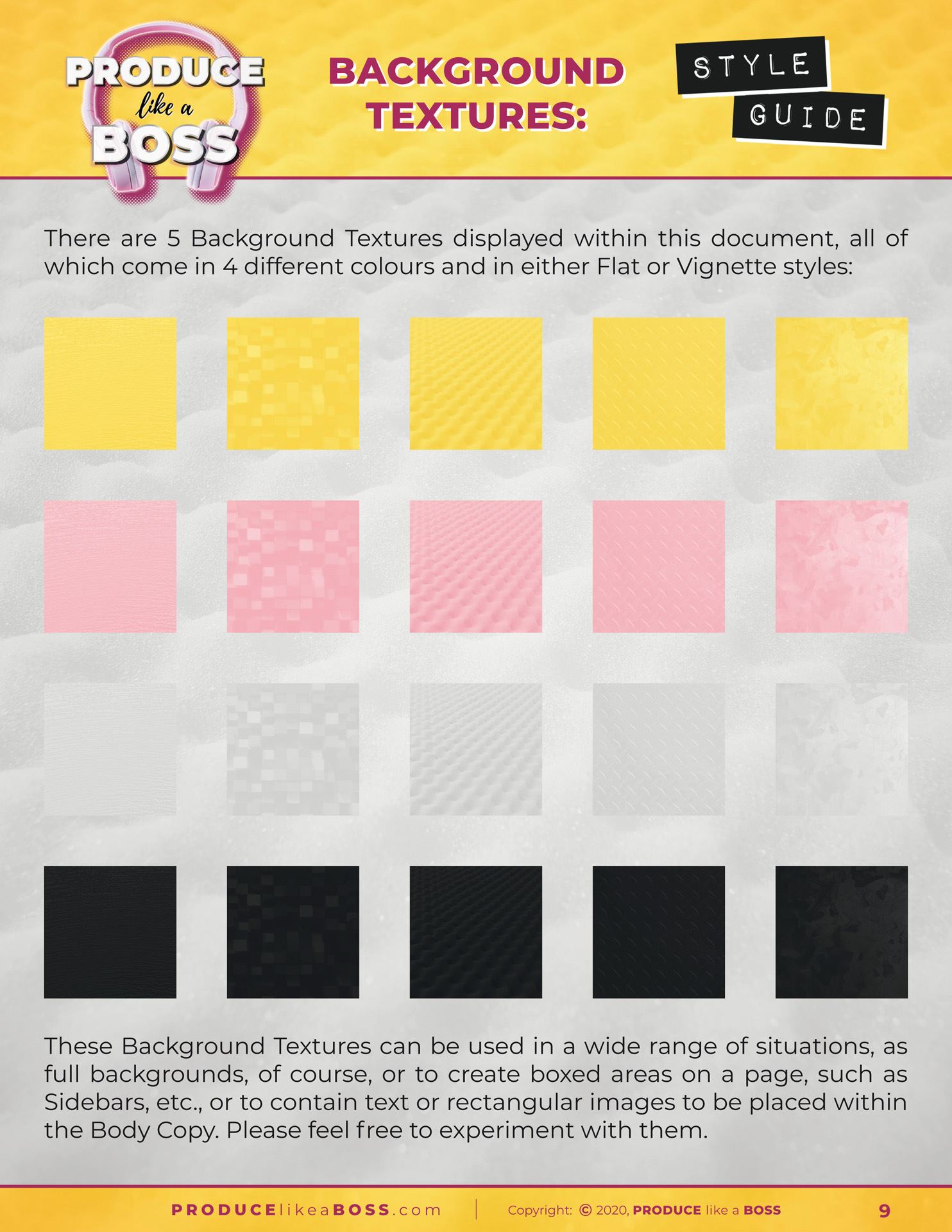
Background Textures Page
Using a texture in the background of your assets can help to soften the appearance of a document and provide a feel or vibe to your branding. However, they’re not suitable for every project, so, again, it’s entirely up to you whether you wish to include them during the Branding Design process.
If you do want to have background textures form a part of your brand’s styling, this is where the different textures will be featured and their application described.
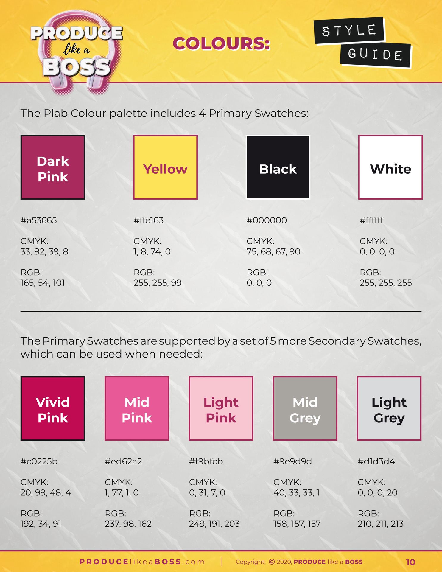
Colour Chart Page
Every brand will have a colour palette of at least 3 separate colours, perhaps just black and white, with a single accent colour. However, many businesses will opt to employ a number of different colours… or a number of shades of one or more ‘parent’ colours… or even several tones based on a blend from one colour to another.
The options are many and varied, as colour plays a huge part in the look and feel of your branding. Whatever you choose, your colour palette(s) will be featured in a page similar to this one, providing any 3rd Party designer or artworker with all they need to reproduce your colours accurately, using colour references for CMYK, RGB, HEX and Pantone references, as applicable.
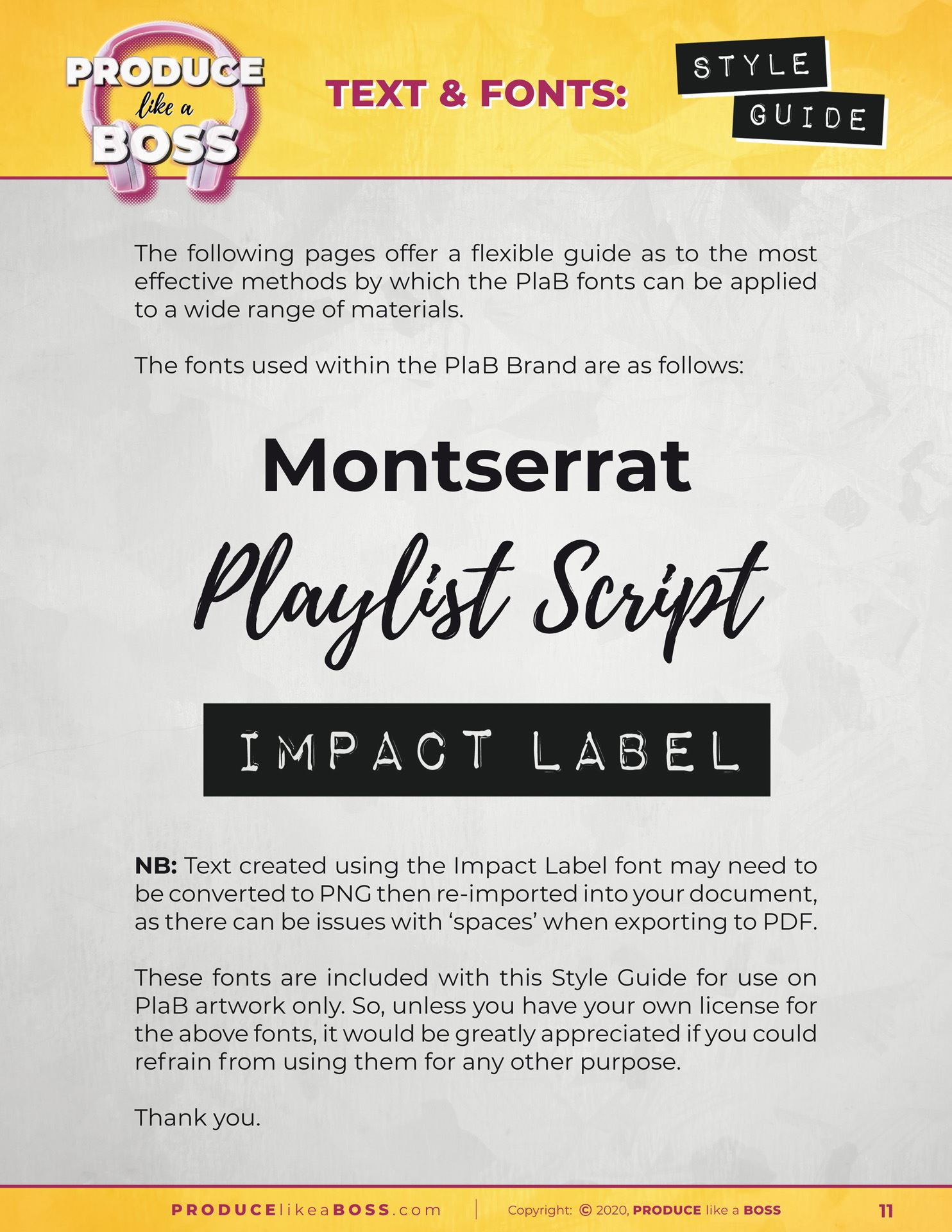
Introduction to Text and Fonts Page
This page offers a brief introduction to all the Fonts that are used when creating any kind of text for assets and other documents.
Fonts play a huge role in the styling of your brand and are a key element of every asset design, so it’s important to ensure there is no confusion over which fonts are used and what they look like in their raw form, which is what this page is for.
You’ll notice that there is also a disclaimer, warning users not to use these fonts for any other projects unrelated to your brand unless they possess their own independent license allowing them to do so.
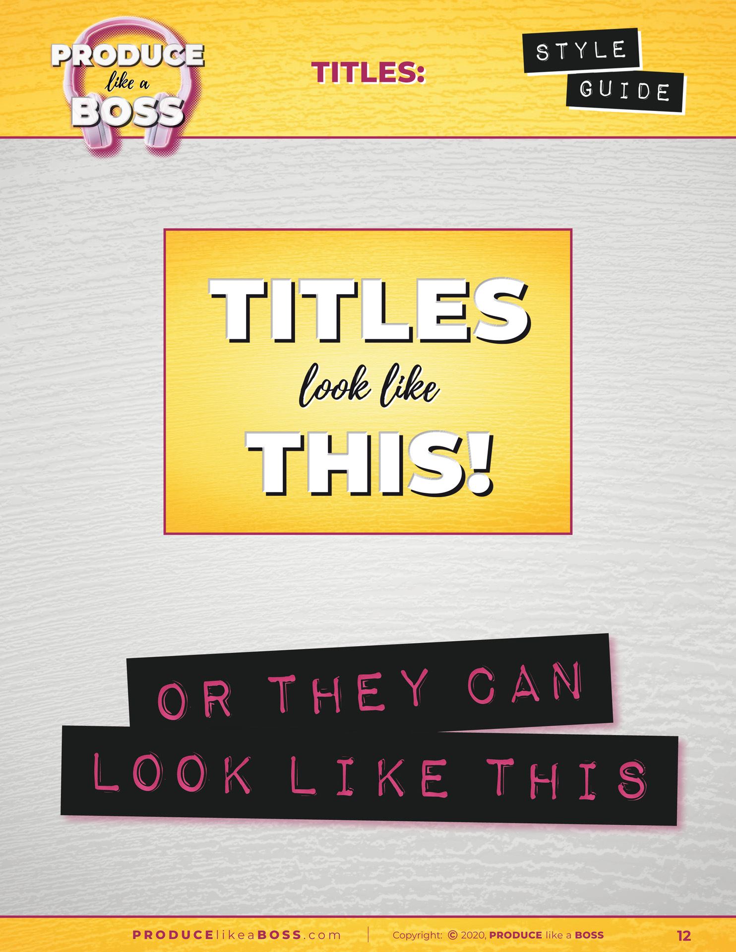
Titles Text Formatting Page
Document Titles tend to occupy an area outside of the main content block and are often formatted differently to page headers, even if they use the same fonts, so that is what this page is dedicated to, describing the arrangement and formatting of main titles in a straightforward visual way, which makes it simple for the user to duplicate.
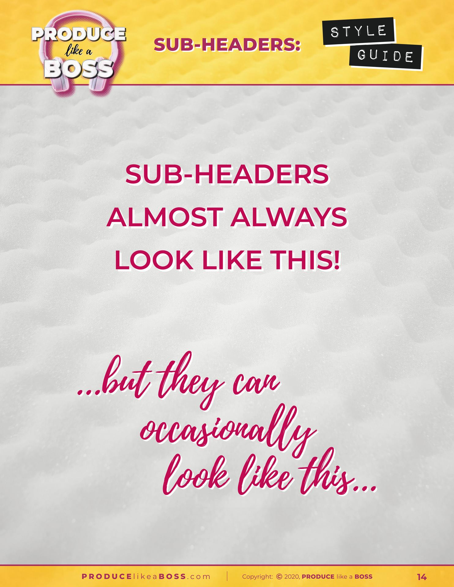
Sub-Headers Text Formatting Page
Again, Headers and Sub-Headers tend to be above the main content area, not interacting with the rest of the content, so these need to be specified separately, just as titles and sub-titles.
This page is given over to these text elements, but some Style Guides won’t require such individual treatment for these aspects, so they can be featured along with the rest of the text elements, which, here, follow on the next page.
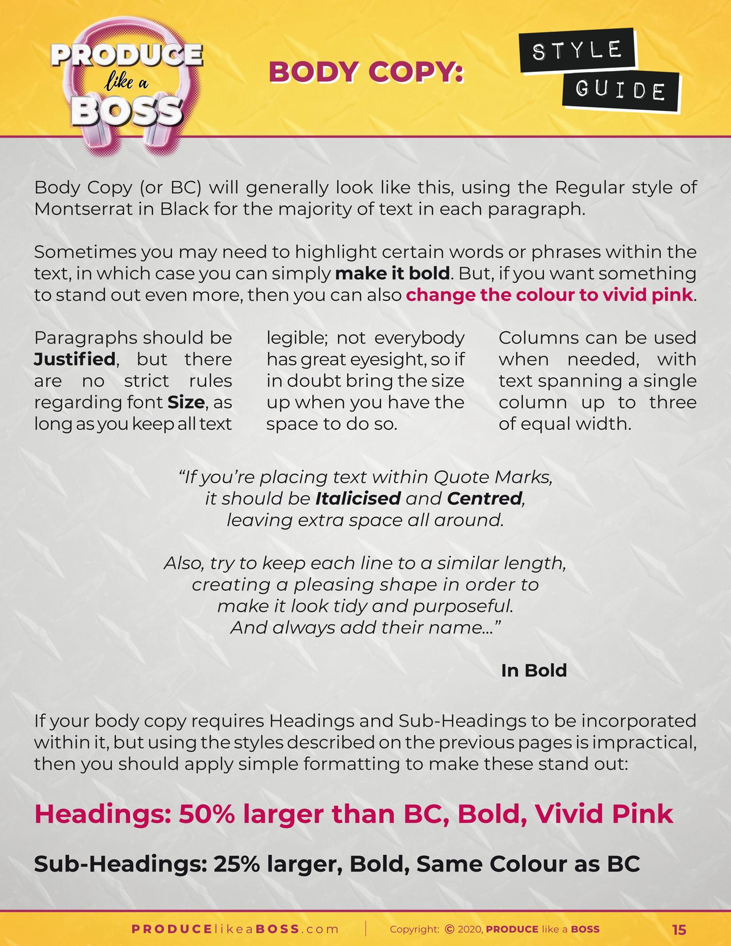
Body Copy Text Formatting Page
Probably the most important type of text element, body copy must be perfectly legible, so the choice of font should be easy to read and should ideally be a family of font with a decent number of variants, such as Regular, Bold, Extra Bold, Thin, Extra Thin, Condensed, etc., preferably with italic versions of each. Some font families have many variations, often numbered to denote their strength.
These variants of a single font allow the user to format the body copy in many ways in order to help certain words or passages to stand out among the rest of the text, as well as creating special text elements, such as Block Quotes, Splashes, Special Offers, etc., all of which need to be visually differentiated from one another, so as to make it easy for the reader to tell one section of text from another.
Colour also plays a huge part in this differentiation of separate text elements and special formatting, such as All Caps, Small Caps, Superscript, Subscript, drop-shadows, Outlines and more can be utilised to great effect when done properly.
However, overuse of these formatting techniques can ruin the flow of your Body Copy, hence the importance of this page in your Style Guide – and the importance of employing an experienced designer who understands the finer points of typography and can execute the design of an asset with expertise and taste.
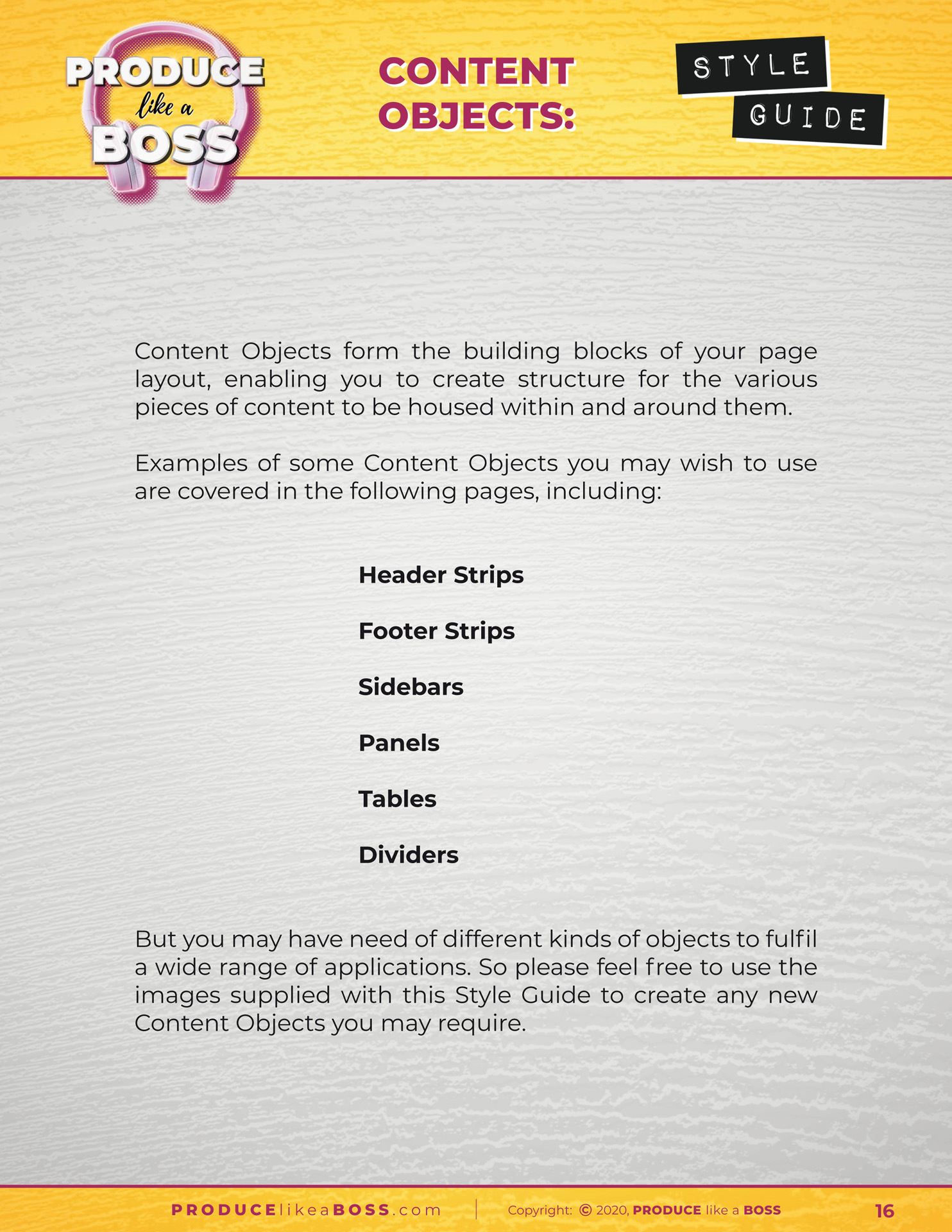
Introduction to Content Objects Page
The use of Content Objects within an asset’s layout allow a designer to structure the page in a wide variety of ways.
The design of these structural elements will be created during the Branding Design process, according to the needs of each of the 5 assets produced for this purpose, so they will vary from one brand to another. Some typical Content Objects are listed on this page, as an introduction to the various types of object available.
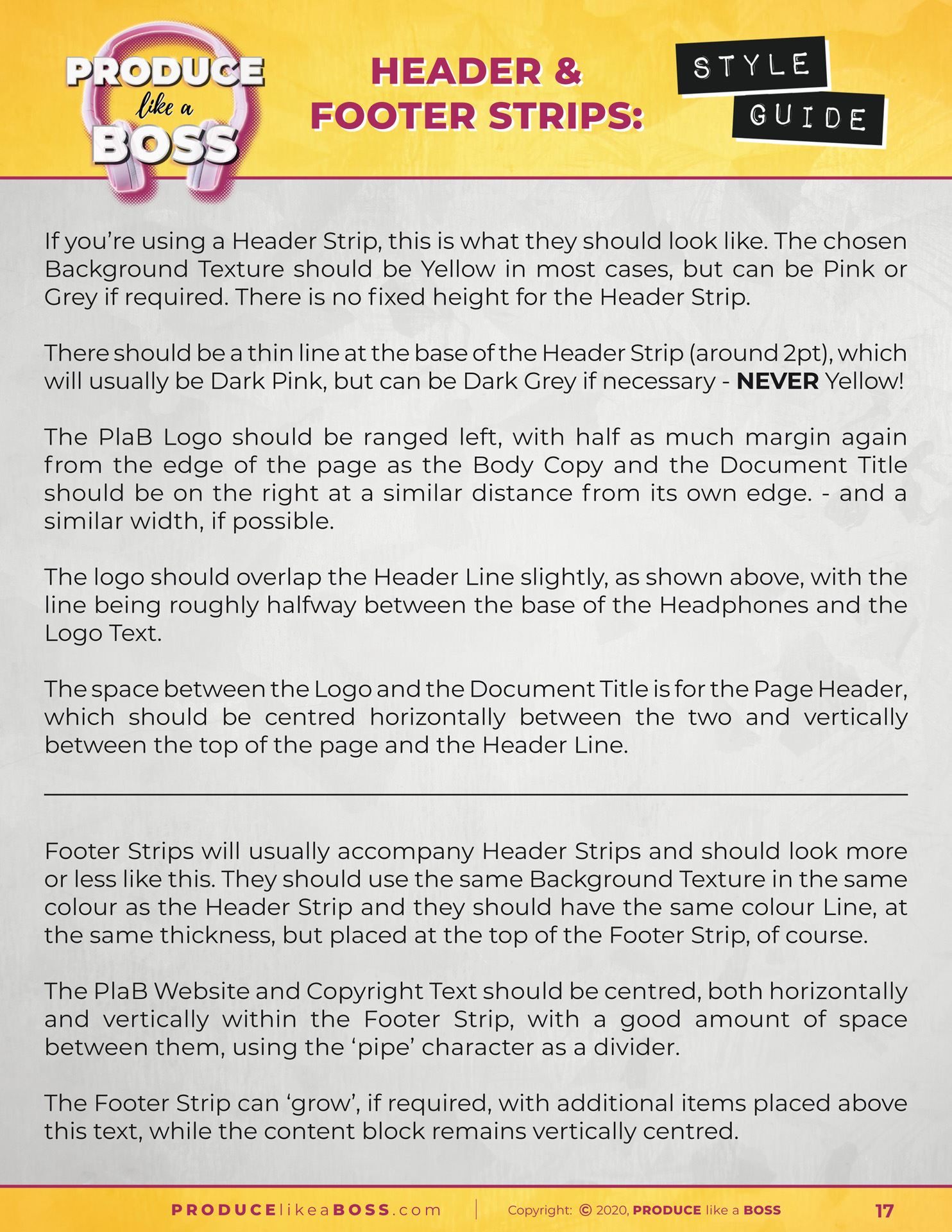
Header and Footer Strips Styling Page
This page describes the use and application of Header and Footer Strips, as they pertain to this specific brand.
Your own Headers and Footers may look completely different, but it’s highly recommended that these two objects are available, as they play an important role in the structure of most assets, allowing for a more interesting and effective use of the available space by visually separating different sections from one another.
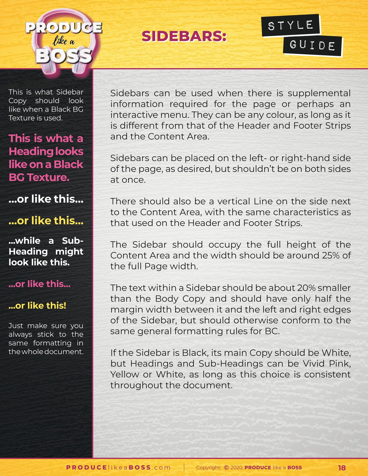
Sidebars Styling Page
Sidebars aren’t everyone’s cup of tea, but they work particularly well for this brand, providing another structural element for the arrangement of content on a page.
However, they won’t suit the styling of every brand, so they may not be ideal for yours, but they’re certainly worth considering, especially for long-form documents which require additional information that needs to be separate from the main content for one reason or another, such as technical manuals, magazines and sales catalogues.
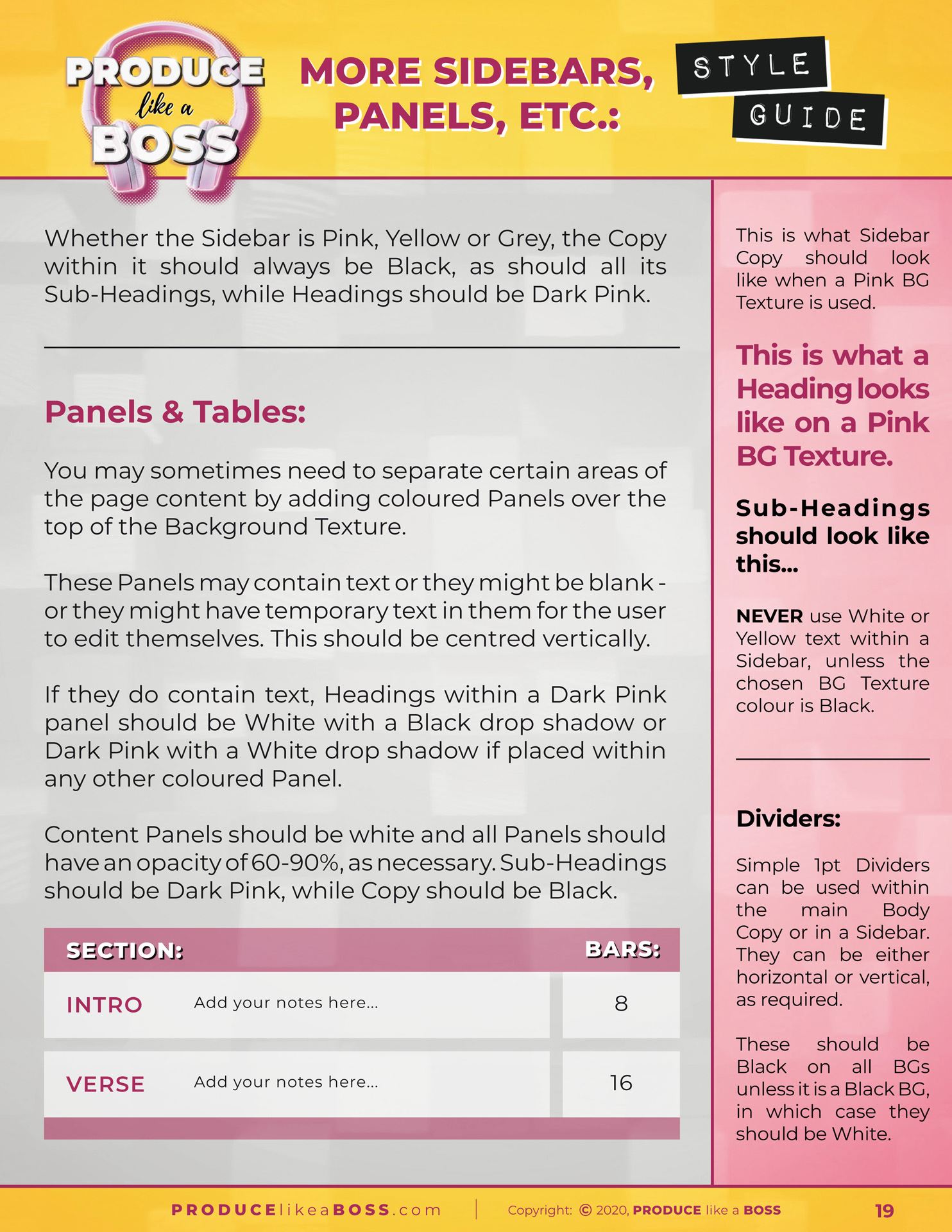
Additional Content Objects Styling Page
This is the last page of this particular Style Guide, describing some of the additional Content Objects, most of which appear within the body of the content, rather than fulfilling the role of a structural element.
Panels, tables and dividers offer alternative methods of differentiating sections of text within the main content, which, in some cases, adds visual interest or, in the case of dividers, simply separates one section from another, making this separation clear to the reader.
There are a myriad of possibilities when it comes to this kind of content object, such as Splashes, which can take any shape, from a simple box, circle or oval, to a star, a speech or thought bubble or a wavy-edged blob… or anything in-between. Imagination really is the limit!
Other possible content objects include, but are not limited to… Graphs, Charts and Diagrams, Tabs, Frames and Containers, Buttons, Glyphs and Icons, Bar Codes and QR Codes, Arrows and Pointers, Vertical and Horizontal Dividers, Place holders, Brackets and Spacers… The list goes on… and each one of these can be styled to perfectly match your branding!
Well, I hope the above example pages help to give you an insight into what you should expect from your own Style Guide, once it is completed.
Of course, your Style Guide will look completely different from that of Produce like a Boss, as it will adhere to your specific branding, using your selected fonts, colours, foreground and background images, textures and other content elements, all of which will be designed in such a way as to become part of your brand, as well as all the rules and guideline definitions that apply to your tailored styling.
